FEWDRemote
Lecture 6: Grids
-
Stacks on stacks on stacks, fam
-
Objectives
- Explore CSS’s box model
- Understand the difference between margin/border/padding
- Begin building complex grids with CSS
-
Agenda
Warmup
-
For the following two images - with a partner - on your screen, draw out the HTML divs/sections you would have to use to create that layout.
-
Options
-
BaseCamp

-
Wistia

The Box Model
-
The Box Model is a way of thinking about CSS DOM elements on the page. Instead of thinking of HTML elements as bits of HTML wrappers we style, we can think of them as boxes with specific dimensions and properties. Given this though, an HTML layout can be thought of as boxes within boxes.
-
Exercises
-
Display Inline to Block | LIVE Instructor Version
-
Display Block to Inline-Block | LIVE Instructor Version
-
Simple Layouts | LIVE Instructor Version
-
Margin, Padding, Border
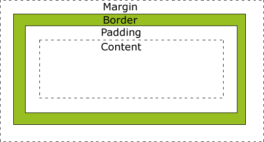 Margin: space in between DOM elements
Padding: space within the DOM element
Border: the outline around the DOM Element.
In general, the width of a DOM element is padding + border + content.
Margin: space in between DOM elements
Padding: space within the DOM element
Border: the outline around the DOM Element.
In general, the width of a DOM element is padding + border + content.
-
Implications
The main implications of this has to do with building rows with multiple tags / items inside of it. The widths adding up to 100% isn’t enough – the width + padding + border + margin must add up to 100%!
-
Box Sizing
This is a useful tool. We can use box-sizing to force the padding to be pulled into our content width. This way, padding is not added to the overall width. Types: content-box, border-box
Flexbox
👇👇👇
-
The flex layout is a series of CSS properties that allows the container element to alter the dimensions of its children elements. A flex container will expand items to fill available space if there is any and shrink them to avoid overflow.
-
Consider the following image

-
Basic Example
-
Flex basis, width, grow, shrink
- If no flex-basis specified, we fall back to width
- flex-basis is the default size the browser tries to draw the columns to
- if flex-basis width can be respected and items will fit in container, 👍
- else, it will rely on flex-grow or flex-shrink to determine how to layout the items
- flex-grow/shrink of 0 means do not grow
- 1 means same size
- 2 is twice relative to the others, etc
-
justify-content/align-items
- how to align horizontally: justify-content. apply on container
- vertically: align-items. apply on container
NOTE: there is an align-self that can be applied to individual items in flex container
-
More info:
-
Exercises
-
Simple Flex: Basic Practice | Live Notes
-
Simple Flex 2: Basic Practice | Live Notes
-
Simple Flex 3: Basic Practice | Live Notes
-
Simple Flex 4: Basic Practice | Live Notes
Practical CSS3 Usecases
-
These are examples of CSS3 uses that we will either cover today or at some point in the duration of the course.
-
Exercise
See if you can implement some of the more simple ones outlined here into one of your websites (either the resume or the Wendy Bite).
-
CSS Use Cases
Here are some interesting use cases where CSS3 in particular becomes super handy.
-
Animations
You can do some really awesome work with animating your elements.
-
Transitions
Transitions are animations that are triggered usually by some form of user interaction.
-
Pseudo Selectors
Psuedo classes allow us to style specific types of element features, i.e. the :hover pseudo selector can be used to style an element as the user puts his mouse over it.
- Menu Hover Effect Other examples of pseudo selectors: :visited, :after, etc
-
Overflows
Keep track of content and determine how it should behave if there is more content than space in the container.
-
Grids
This one is super expansive and you could literally teach an entire course on this. For now, take a look at a few examples / problems to gain perspective on this.
-