FEWDRemote
Lecture 7: Grids Practice
-
It’s practicing time, fam

-
Learning Objectives
- Practice using grids
-
Agenda
- Review Final Project Specs
- Review Flexbox
- Practice
- Moar Practice
Final Project Specs
Review Flexbox
👇👇👇
-
The flex layout is a series of CSS properties that allows the container element to alter the dimensions of its children elements. A flex container will expand items to fill available space if there is any and shrink them to avoid overflow.
-
Consider the following image

-
Basic Example
-
Flex basis, width, grow, shrink
- If no flex-basis specified, we fall back to width
- flex-basis is the default size the browser tries to draw the columns to
- if flex-basis width can be respected and items will fit in container, 👍
- else, it will rely on flex-grow or flex-shrink to determine how to layout the items
- flex-grow/shrink of 0 means do not grow
- 1 means same size
- 2 is twice relative to the others, etc
-
justify-content/align-items
- how to align horizontally: justify-content. apply on container
- vertically: align-items. apply on container
NOTE: there is an align-self that can be applied to individual items in flex container
-
More info:
Practice
👇👇👇
-
-
Basic Layouts
NOTE: you will likely have to add some of your own CSS styles here as well to achieve the gray boxes and min-heights.
-
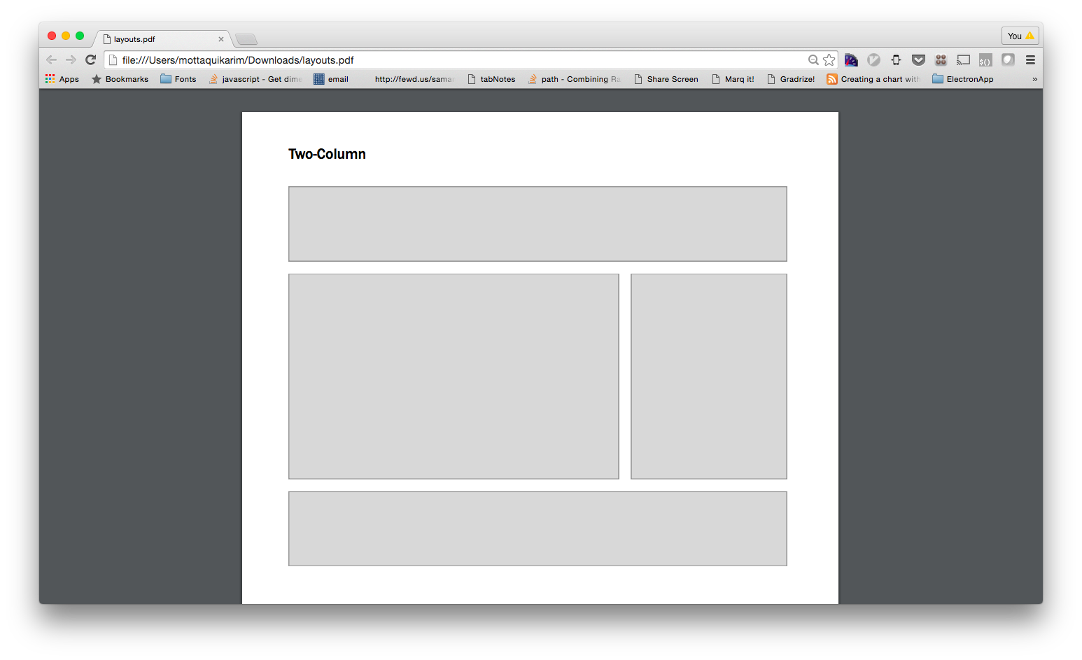
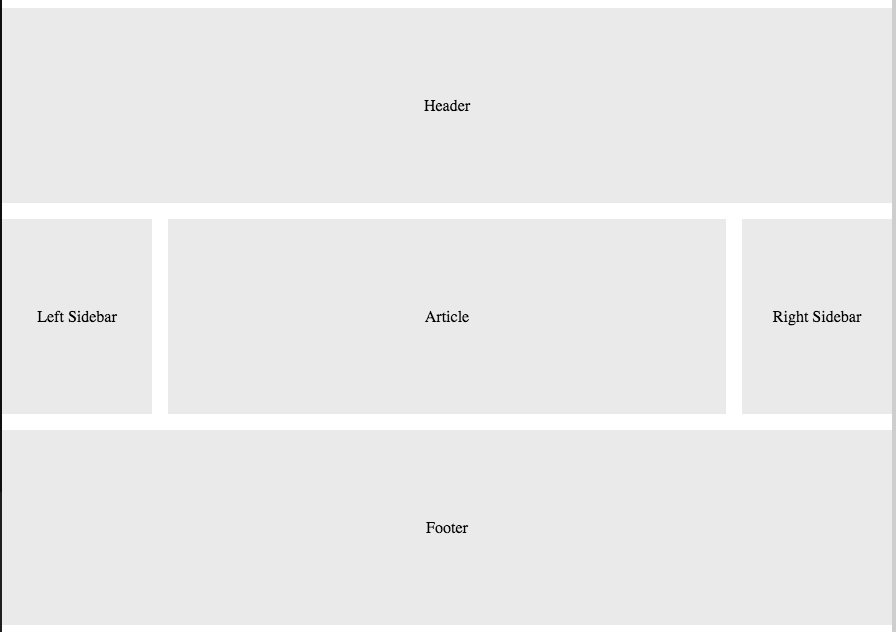
Simple Layout
-
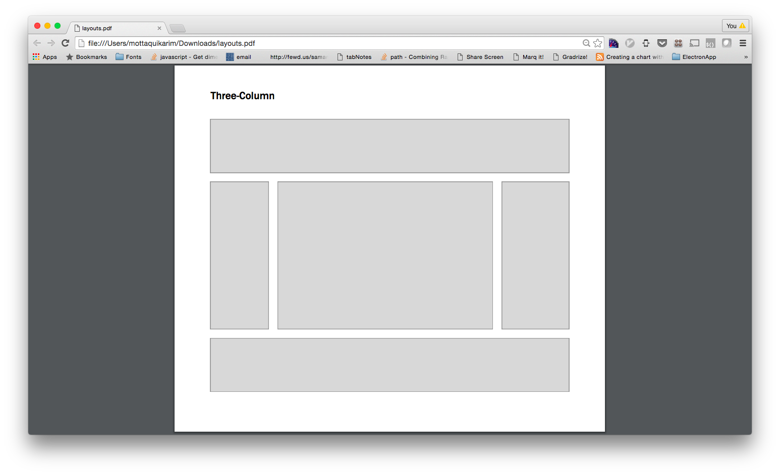
Three Column Layout
-
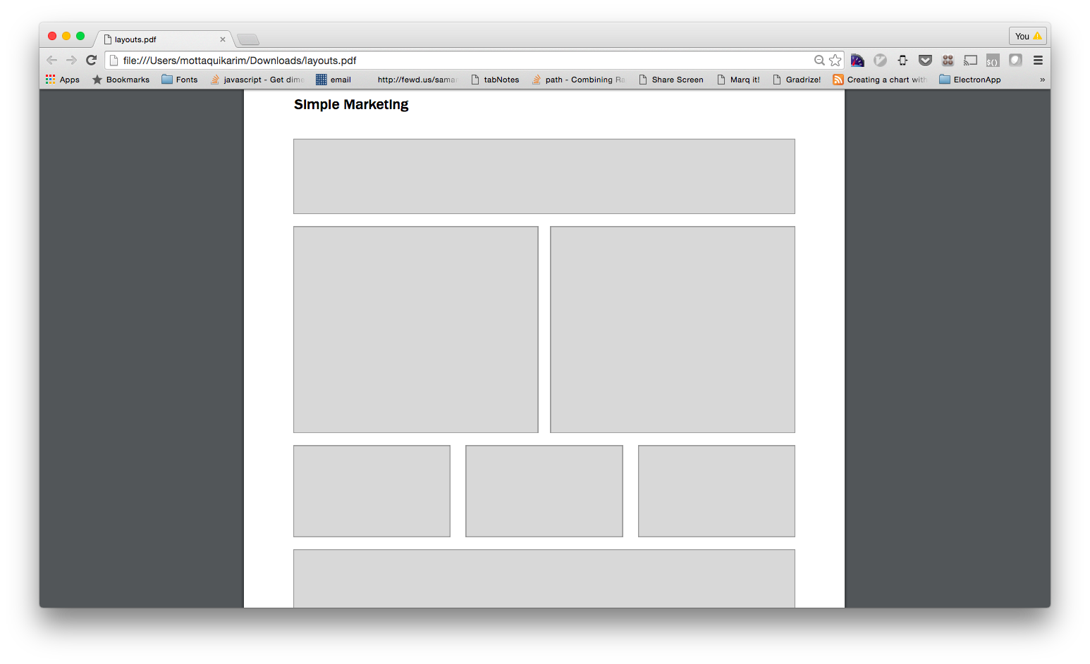
Simple Marketing
-
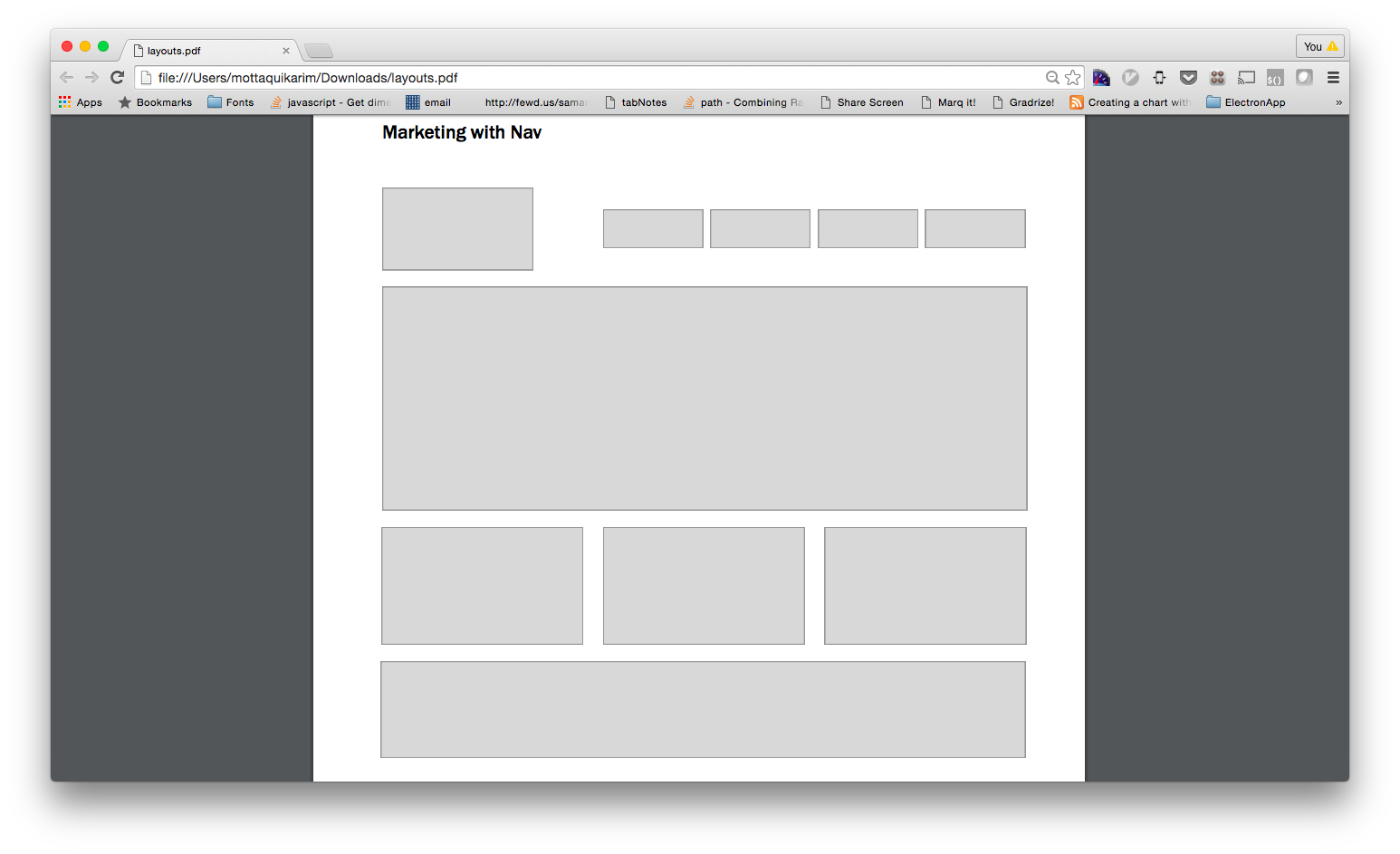
Marketing with Nav
-
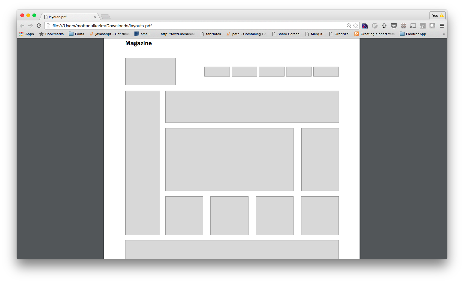
Magazine
-
Layouts
Moar Practice
👇👇👇
-
Please use this repo as a starting point. Each layout can be its own webpage.
-
-

-

-

-

-

HOMEWORK
Due: Tuesday March 27th, midnight