FEWDRemote
Lecture 8: Frontend Frameworks
-
Gridz on gridz on gridz, fam
-
Learning Objectives
- Responsive web development!
- Understand how to build multilayered grids with a Front-End Framework
- Understand how we can override the default styles of a framework with our own CSS
-
Agenda
- Styling for various Screens
- Grids
- Frontend Frameworks
- Resume Lab
Styling for various Screens
-
Learning Objective: Understand how to apply CSS towards building web layouts that work in multiple screens.
-
Basics
- We want to have the SAME markup for ALL of our webviews
- A website is responsive if the site layout changes based on the width of the browser pages but can compensate for any width.
- A website is adaptive if the site layout changes based on the width of the browser but only for predetermined widths.
-
Examples of responsive sites
-
Always place this in your HTML
<html>
    <head>
        ...
        <meta name="viewport" content="width=device-width, initial-scale=1.0;">
        ...
    </head>
    ...
</html>
-
Mobile First VS. Desktop First
These two schemas are techniques for how we structure our css. Most important takeaway: almost always go with mobile first.
(Remember, CSS is cascading which means that we can write one set of styles and then reapply other styles on top of that.)
-
Mobile First
With mobile first, we create the mobile layout first, then add a media query for tablet (with tablet styles) and then add a media query for desktop (with desktop styles)
-
Desktop First
With desktop first, we create the desktop layout first (so styles for desktop), then add a media query for tablet, then mobile.
-
Mobile First > Desktop First
Here’s why: forces you to think about the stuff that’s really necessary for simplest version of your page and implement those
With mobile first, you simply add styles as needed as width increases (vs removing styles the other way around, which leads to writing more code)
-
Examples
Here are some examples of different media queries.
-
Common Breakpoints
NOTE: you should NEVER design for device specificity. Read this.
/* Smartphones (portrait and landscape) -- */
@media only screen and (min-device-width : 320px) and (max-device-width : 480px) {
/* Styles */
}
/* Smartphones (landscape) -- */
@media only screen and (min-width : 321px) {
/* Styles */
}
/* Smartphones (portrait) -- */
@media only screen and (max-width : 320px) {
/* Styles */
}
/* iPads (portrait and landscape) -- */
@media only screen and (min-device-width : 768px) and (max-device-width : 1024px) {
/* Styles */
}
/* iPads (landscape) -- */
@media only screen and (min-device-width : 768px) and (max-device-width : 1024px) and (orientation : landscape) {
/* Styles */
}
/* iPads (portrait) -- */
@media only screen and (min-device-width : 768px) and (max-device-width : 1024px) and (orientation : portrait) {
/* Styles */
}
/**********
iPad 3
**********/
@media only screen and (min-device-width : 768px) and (max-device-width : 1024px) and (orientation : landscape) and (-webkit-min-device-pixel-ratio : 2) {
/* Styles */
}
@media only screen and (min-device-width : 768px) and (max-device-width : 1024px) and (orientation : portrait) and (-webkit-min-device-pixel-ratio : 2) {
/* Styles */
}
/* Desktops and laptops -- */
@media only screen  and (min-width : 1224px) {
/* Styles */
}
/* Large screens -- */
@media only screen  and (min-width : 1824px) {
/* Styles */
}
/* iPhone 4 -- */
@media only screen and (min-device-width : 320px) and (max-device-width : 480px) and (orientation : landscape) and (-webkit-min-device-pixel-ratio : 2) {
/* Styles */
}
@media only screen and (min-device-width : 320px) and (max-device-width : 480px) and (orientation : portrait) and (-webkit-min-device-pixel-ratio : 2) {
/* Styles */
}
/* iPhone 5 -- */
@media only screen and (min-device-width: 320px) and (max-device-height: 568px) and (orientation : landscape) and (-webkit-device-pixel-ratio: 2){
/* Styles */
}
@media only screen and (min-device-width: 320px) and (max-device-height: 568px) and (orientation : portrait) and (-webkit-device-pixel-ratio: 2){
/* Styles */
}
/* iPhone 6 -- */
@media only screen and (min-device-width: 375px) and (max-device-height: 667px) and (orientation : landscape) and (-webkit-device-pixel-ratio: 2){
/* Styles */
}
@media only screen and (min-device-width: 375px) and (max-device-height: 667px) and (orientation : portrait) and (-webkit-device-pixel-ratio: 2){
/* Styles */
}
/* iPhone 6+ -- */
@media only screen and (min-device-width: 414px) and (max-device-height: 736px) and (orientation : landscape) and (-webkit-device-pixel-ratio: 2){
/* Styles */
}
@media only screen and (min-device-width: 414px) and (max-device-height: 736px) and (orientation : portrait) and (-webkit-device-pixel-ratio: 2){
/* Styles */
}
/* Samsung Galaxy S3 -- */
@media only screen and (min-device-width: 320px) and (max-device-height: 640px) and (orientation : landscape) and (-webkit-device-pixel-ratio: 2){
/* Styles */
}
@media only screen and (min-device-width: 320px) and (max-device-height: 640px) and (orientation : portrait) and (-webkit-device-pixel-ratio: 2){
/* Styles */
}
/* Samsung Galaxy S4 -- */
@media only screen and (min-device-width: 320px) and (max-device-height: 640px) and (orientation : landscape) and (-webkit-device-pixel-ratio: 3){
/* Styles */
}
@media only screen and (min-device-width: 320px) and (max-device-height: 640px) and (orientation : portrait) and (-webkit-device-pixel-ratio: 3){
/* Styles */
}
/* Samsung Galaxy S5 -- */
@media only screen and (min-device-width: 360px) and (max-device-height: 640px) and (orientation : landscape) and (-webkit-device-pixel-ratio: 3){
/* Styles */
}
@media only screen and (min-device-width: 360px) and (max-device-height: 640px) and (orientation : portrait) and (-webkit-device-pixel-ratio: 3){
/* Styles */
}
(Responsive) Grids
-
Exercise
Add responsive styles such that the column “rows” collapse into stacked bars when page width is less than 550px.
-
Simple Layout
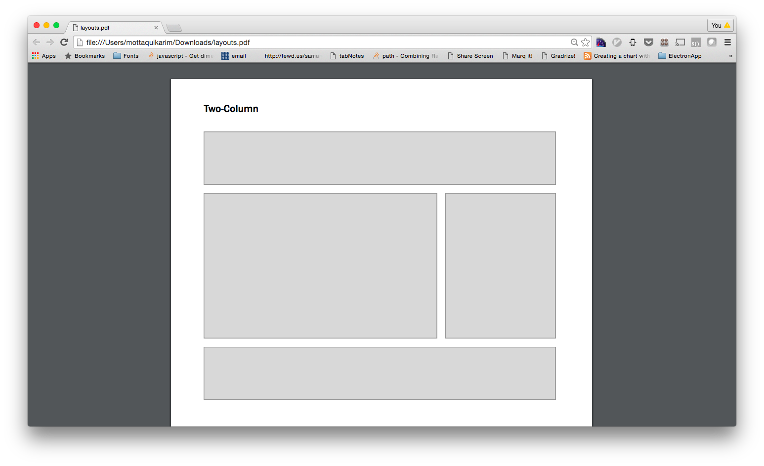
-
Three Column Layout
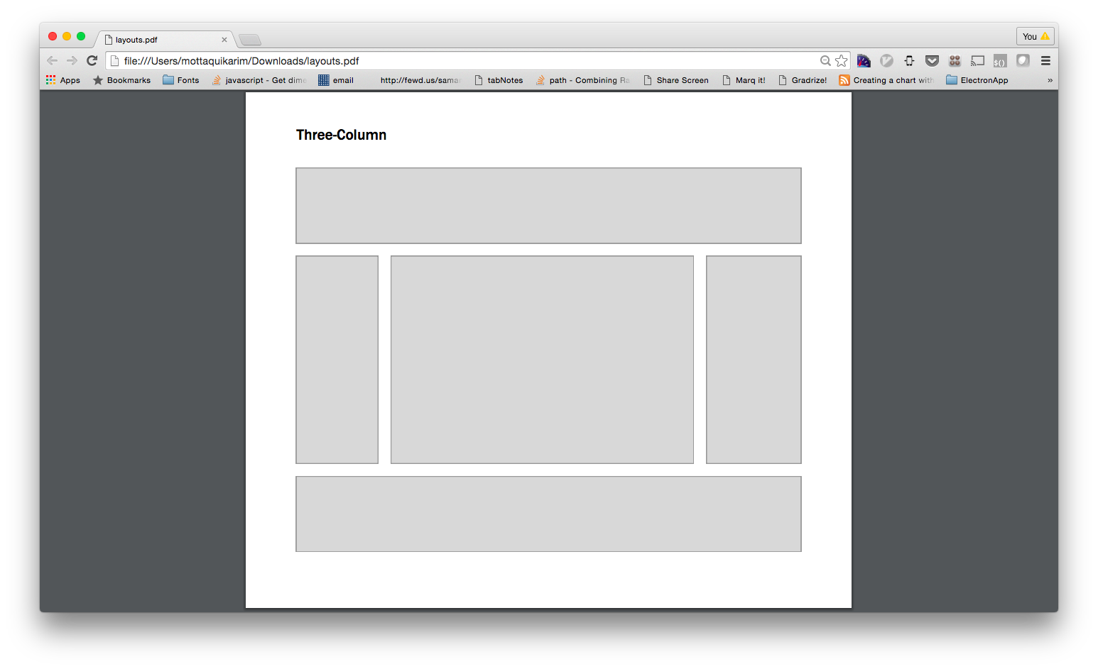
-
Simple Marketing
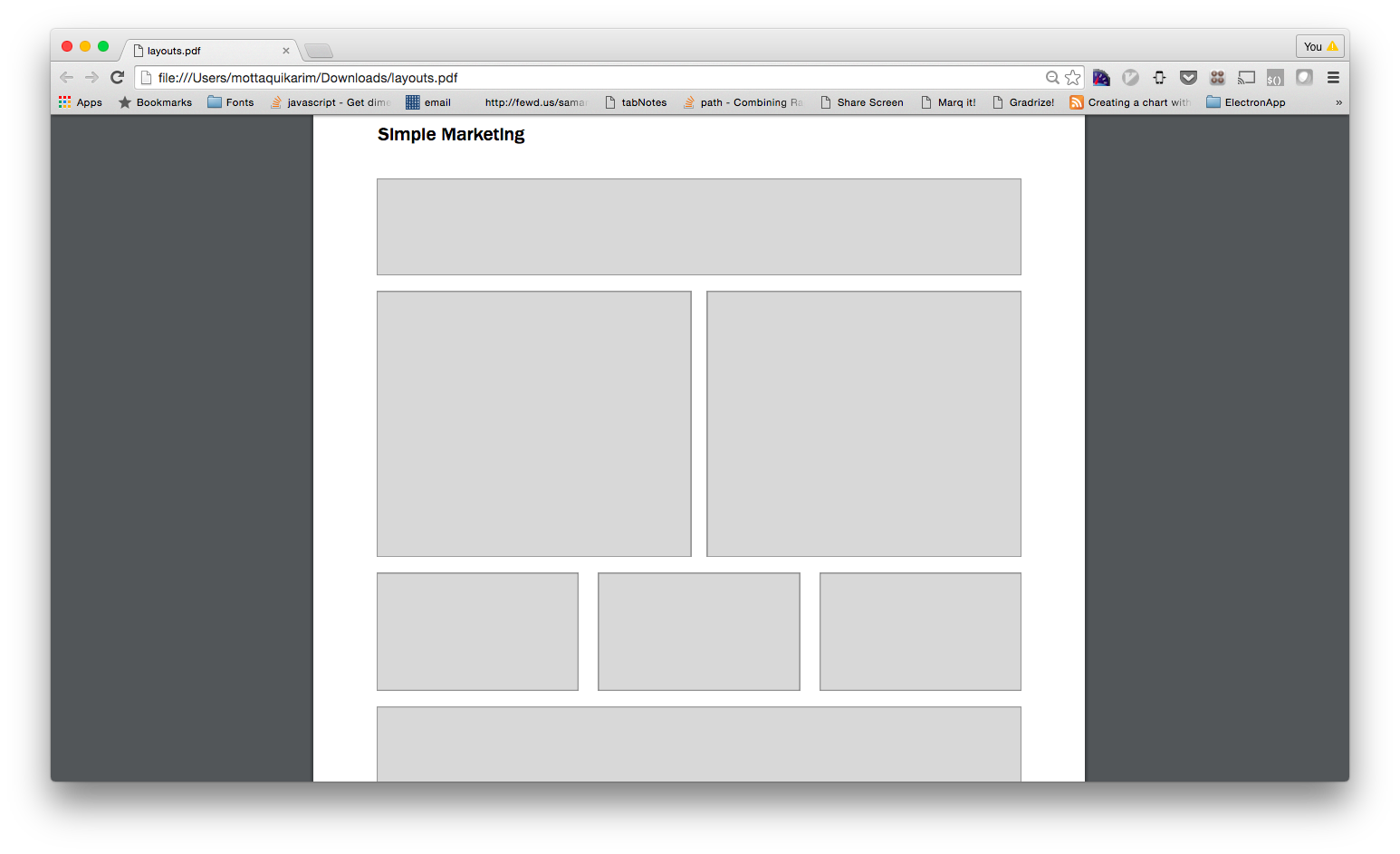
-
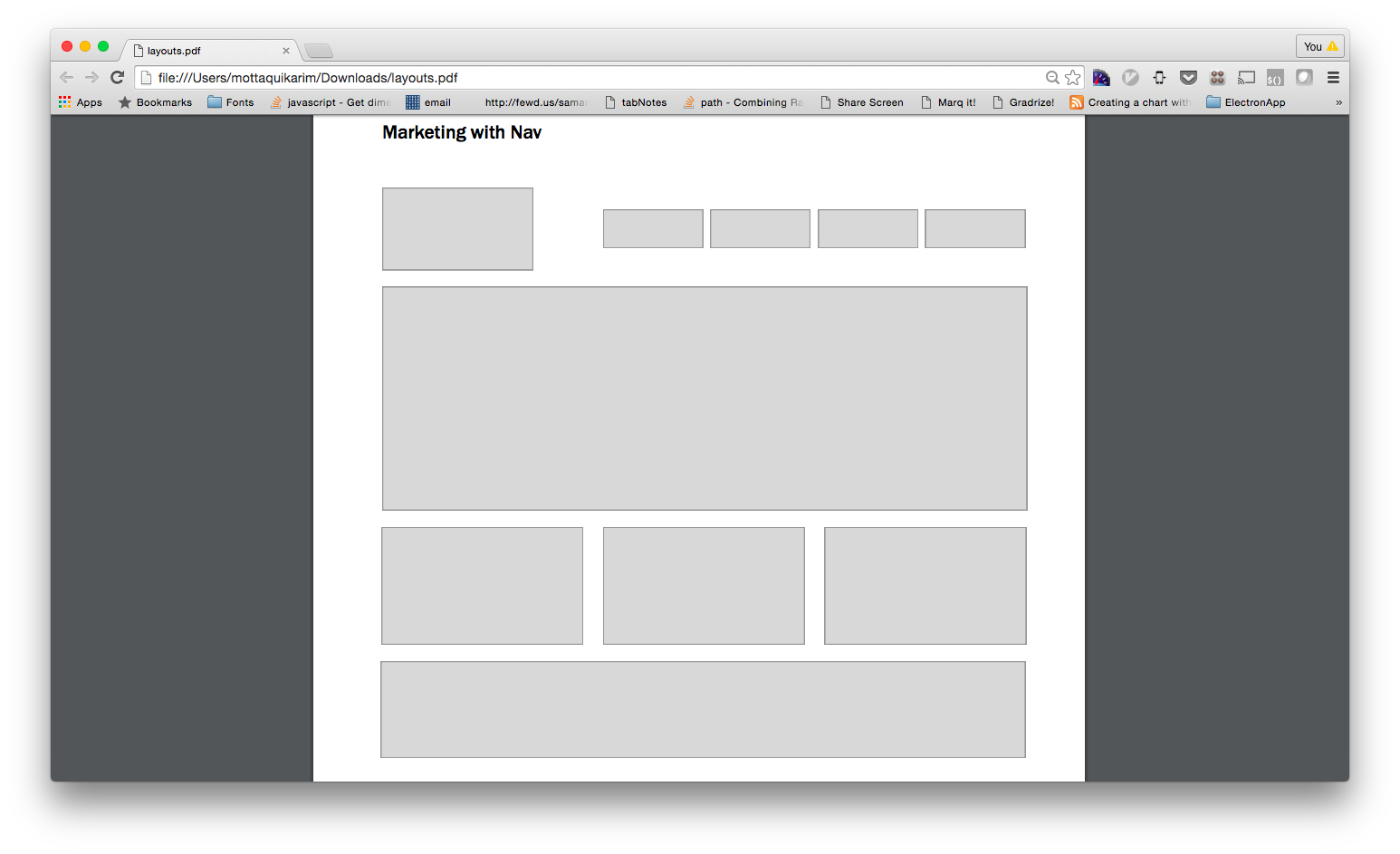
Marketing with Nav
Do not apply collapse style to nav
-
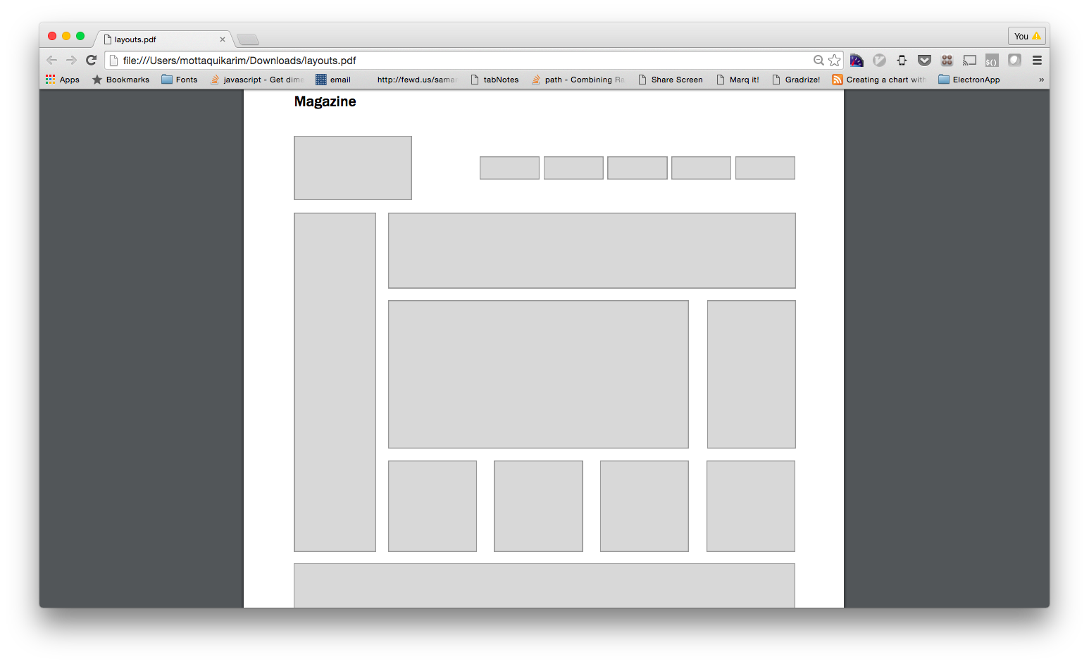
Magazine
Do not apply collapse style to nav
Frontend Frameworks
-
Learning Objective: What are front-end frameworks and how do they allow us to create modern, professional looking websites?
-
Semantic UI
Some quick facts:
- They write the CSS and HTML blocks for you, all you do is copy and paste
- With a basic understanding of HTML/CSS, you can easily start building professional looking websites Visit their website. Read the docs.
-
Material Design
Some quick facts:
- Built by Google.
- Follows the Material Design spec that a lot of new Google apps now implement (like Google Calendar, Google Inbox, etc). Visit their website.
-
Bootstrap
Some quick facts:
- Built by your boys over @twitter, it is a framework for quickly building out complex webpages
- Probably the most popular front-end framework. Visit their website. Read the docs.
-
Primer
Some quick facts:
- Build by your boys over @github
- Much simpler than bootstrap
- Lighter weight too! Visit their website.
-
Exercise
Let’s get a simple site going that pulls in one of the following frameworks. Let’s then use the documentation to build out a simple UI element using that framework. Frameworks are basically CSS stylesheets that were developed by other people. They are built in such a way that you don’t have to spend time and energy building out commonly reusable components like buttons and input fields, etc
(Framework) Grids
-
Exercise
Let’s see if we can rebuild our layouts using a frontend framework. Create a new project and then using the documentation provided by your the Bootstrap frontend framework, rebuild the following layouts. NOTE: you will likely have to add some of your own CSS styles here as well to achieve the gray boxes and min-heights.
-
Simple Layout
-
Three Column Layout
-
Simple Marketing
-
Marketing with Nav
-
Magazine
Resume Lab
-
Learning Objective: How can we build a professional looking website with a frontend framework?
-
Exercise
Let’s revisit our resume page. We will create a resume webpage using Semantic UI.
-
Requirements
Open ended! Let’s have fun with this and use our exploration as an excuse to learn more about the modules offered by Semantic UI.
HOMEWORK
Don’t forget, hw is due on Tuesday March 27th, midnight.