Data Science
The What, Why, & Who of Data Science
Whether or not they realize, most people have come into contact with data science in their daily lives. We've seen trending articles on digital news outlets, personalized product recommendations from online stores, and advertisments that seemingly hear our every thought and conversation. But what exactly is data science?
WHAT
- Acquiring, organizing, and delivering complex data
- Building and deploying machine learning models
- Conducting statistical analyses, including ANOVA, linear models, regression analysis, and hypothesis tests
- Visualizing data distributions, hierarchical clustering, histograms, pie and bar charts, etc.
WHY
- Identify hidden patterns, correlations, and outliers to glean meaningful insights.
- Based on these insights, validate assumptions, make predictions, define optimizations, and most importantly make strategic decisions.
WHO
Professionals who practice data science for businesses, government institutions, nonprofits, and other organizations might have one of these titles:
- Machine Learning Engineer:
- Work in production code.
- Identify machine learning applications.
- Manage infrastructure and data pipelines
- Data Engineer:
- Create an architecture that facilitates data acquisition and machine learning problems at scale.
- Focus on the algorithm and the analysis rather than the software.
- Research Scienctist:
- Specialized research scientist focused on driving scientific discovery rather than pursuing industrial applications.
- Backgrounds in both data science and computer science.
- Determines new algorithmic optimizations, especially in the realm of AI.
- Advanced Analyst:
- Apply descriptive and inferential exploratory data analysis and modeling.
Effective data science lives at the intersection of...

That's pretty broad though. What skills in each of these areas are needed for data science specifically? A good data scientist:
- MATHEMATICS: Understands statistical concepts and modeling; proficient in R and/or Python
- COMPUTER SCIENCE: Has experience in data engineering (i.e. organizing data, running models, visualizing results, etc.); proficient in R and/or Python
- DOMAIN EXPERTISE: Understands the business and social context of issue and can ask questions that lead to appropriate approaches and insights
Real Data Science Applications
-
Safer, smarter self-driving cars
- Data from sensors, including radars, cameras and lasers, to create a map of its surroundings.
- Create a map of its current surroundings such as proximity to other moving or stationary objects like other vehicles, traffic light signals, sirens, pedestrian crosswalk signals, etc.
- Decisions like when to speed up/down, stop, turn, signal, etc.
-
Pre-emptive code alerts in the ER
- Data from heart monitors, pulse oximeter, arterial lines, ventilators, etc. hooked to patients
- Find commonalities in biological health indicators preceding a code
- Identify patients at risk of imminently coding to give doctors an early warning and increase chances of patient revival
-
Natural disaster prediction
- Data from ships, aircrafts, radars, satellites
- Predict occurrences of natural disasters, the areas to be affected, and (where applicable) the path of the storm
- Earlier predictions to maximize evacuation potential
The Data Science Lifecycle
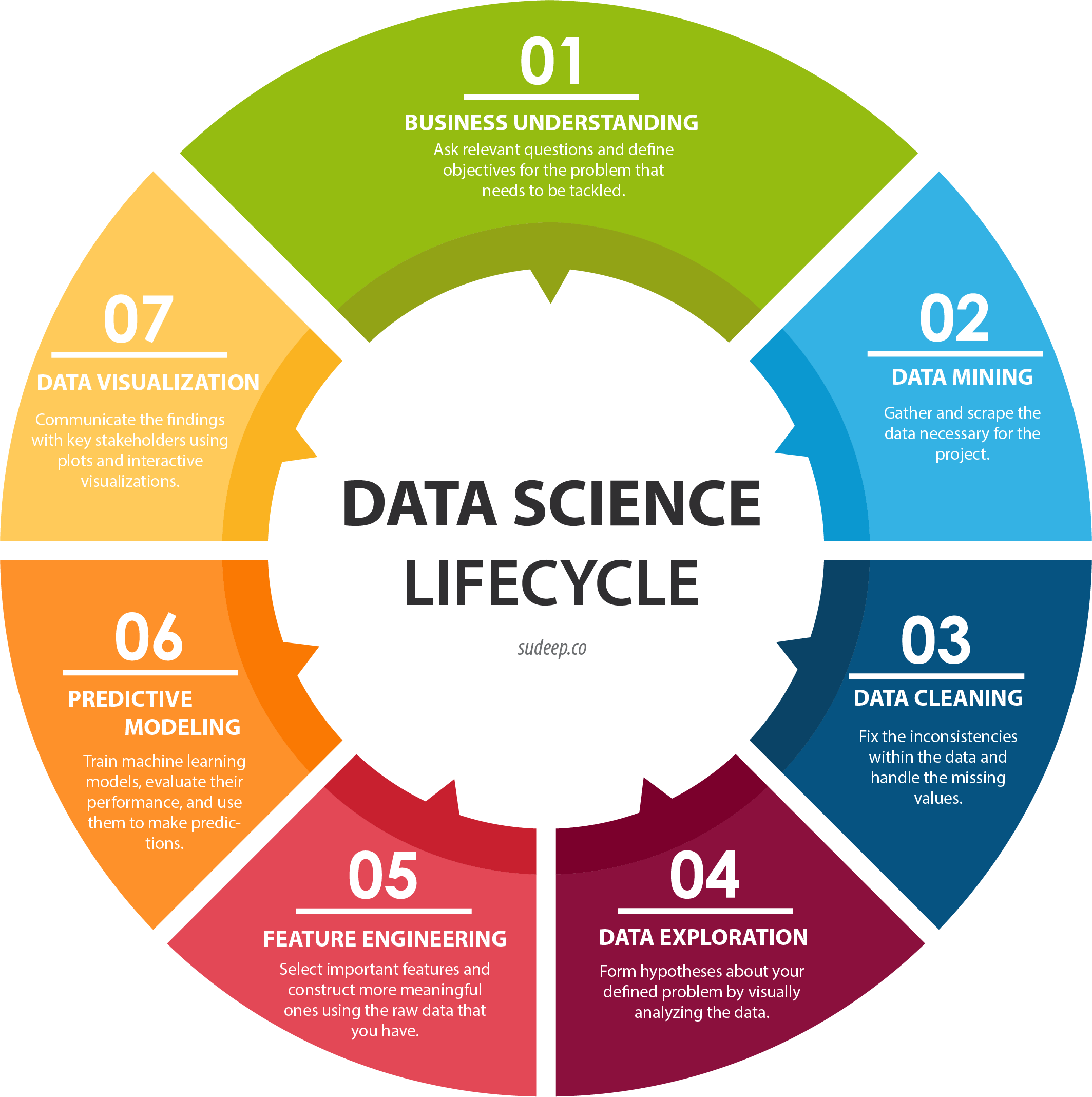
Image Source: http://sudeep.co/data-science/Understanding-the-Data-Science-Lifecycle/
The image above delineates the general steps you would take when you start a data science project. Of course, they're really guidelines because you have to let your results guide you. Sometimes you might skip a step, repeat certain steps, or restart the entire cycle when trying to answer a question. Let's talk through each step using this contextual example:
1) BUSINESS UNDERSTANDING
Data Science Wearables (DSW) is a retail store. DSW is interested in improving their human resource operations. Specifically, as a cost center in the business, this company wants to reduce their expenses associated with staffing the firm's in-store associates across the United States. You have a table of DSW current retail sales associates across department stores. These are some questions you have:
- What drives up costs of staffing?
- Is there an underlying reason for those costs?
- What factors affect HR costs? How could we minimize these?
- What hypothesis can we test to reduce costs?
Let's presume the key cost driver for this HR function is twofold - employees turning over early (low total years of service) and a high time to fill (positions going unfilled, costing producitivity losses). Thus, we start by pursuing the goal of minimizing turnover.
2) DATA MINING
The first three rows of data look like this. Note that "time-to-fill" indicates how long it took to fill this person's role. Typically minimizing time-to-fill is key to lower costs.
| Job Level | Current Employee | Reason for Termination | Years of Service | Candidate Source | Previous Employer | School | Time to Fill (Days) |
|---|---|---|---|---|---|---|---|
| Associate | N | New offer | 1.5 | Referral | Jake's Hawaiian Shirts | NYU | 40 |
| Associate | Y | N/A | 2.0 | Internship | N/A | UCLA | 15 |
| Associate | No | Tardiness | 0.5 | Online | Hats and Caps | Boston College | 25 |
3) DATA CLEANING
The inconsistencies and N/A missing values you see above are incredibly common. In fact, this dataset is comparatively clean and apt for the task at hand. When we start working with Pandas, we will discuss how to handle N/A missing values and other way to ensure data integrity.
4) DATA EXPLORATION
We already looked at the columns in this dataset, but now we want to gain a deeper understanding and create some meaning to help determine our path forward. To do so, we will look at descriptive statistics, probably starting with summary statistics for the different categories in the dataset.
- Min & max years of service and their corresp values
- Means of each var
- Frequency counts of each value in a var
- Plot the distribution of values as a histogram. A histogram uses the frequency counts for a single var, where the values themselves appear on the x-axis and the frequency of each one appears on the y-axis. This helps us gain a quick visual understanding of variance, spread, and skew.

NOTE! Based on this, our original goal of minimizing turnover might change!
5) FEATURE ENGINEERING
This step is where we transition from merely describing and summarizing the data to manipulating and analyzing it. This step always starts with the same question - What else do you want to know about the dataset? The answers to this usually pertain to some pre-existing assumption, ostensible relationships (or lack thereof), unexpected values, or anomalies, which you want to investigate further. In our example with DSW employees, here are some pathways we might choose to follow:
-
We previously assumed the relationship between Time-to-Fill and Years of Service is negative. Is this true? How strong is this negative correlation? If it's significantly and consistently strong, we might choose to use this as hiring criteria going forward. To determine this, we would conduct a statistical correlation analysis.
-
We could repeat the statistical correlation analysis with any pair of variables we think show potential for significant correlation (such as school and application source). But time is money, and we need to choose where to start intelligently! To do this, we might want to visualize the relationships between pairs of variables. In statistics, we often start by creating a scatterplot with a trendline because it allows us to immediately see the spread of data points and how far they are from the trendline.


-
In more complex situations, we might conduct regression analysis to determine the potential for accurately predicting values for Years of Service based on Time-to-Fill values. We could use this to justify building machine learning model to generate a predictive algorithm.
NOTE! It is common for this step to reinforce and revisit the prior step as we discover anomalies or intriguing relationships.
6) PREDICTIVE MODELING
This is where the magic happens. We won't get into the details of machine learning here. However, the model you create for any data science project will be core source of insights and conclusions. Once you have results, it's time to dig in and think outside the box! Ask yourself questions like:
- How do our results compare to our initial hypothesis?
- How statistically significant (i.e. accurate) are our predictions?
- Do we have enough information to draw decisive conclusions? If so, what are they?
- Based on our conclusions, what concrete actions do we recommend?
Remember that your results might not be sufficient after only one iteration. They might point you in the right direction, but they won't necessarily answer all your questions sufficiently. You'll probably have to repeat parts of the cycle several times before you can confidently draw conclusions and make recommendations.
7) DATA VISUALIZATION
This final step is so important, we're going to give it its own section...
Visualizations & Data Storytelling
The single most important takeaway from this walk-through is this - the value of your results depends directly on how well key stakeholders understand them! Data science is valuable because of the insights we can discover using it. You can have all the mathematical evidence in the world for those insights, but your stakeholders have to understand their contextual significance and believe they can turn them into strategic, impactful business actions. Otherwise, what value do those insights have?
Now, a data scientist might not present results to clients or high-level managers, but you do need to be able to explain results to team members who are not expert data scientists.
This where the ubiquitous buzz phrase data storytelling comes into play. The goal of data storytelling is to convey your message in a way that provokes thoughts and ideas, inspires questions, encourages conversation and brainstorming, and ultimately, ignites action. All this boils down to two core pillars:
- Honing a cohesive narrative that establishes a thesis
- Highlighting meaningful key metrics as evidence to support that thesis
Data vizualization is key to this endeavor because it's the easiest way to simplify heaps and mounds of numerical data into a clear message. As the saying goes, a picture can say a thousand words!
Tips for Quality Data Viz
- Focus the message on a central theme. Ensure your visualizations aid the progression of that message appropriately.
- Display the visualization at the appropriate point in your story.
- If you have more than one visualization in view at a time, position each one contextually, according to natural reading eye movement.
- Do not use color for decorative or non-informational purposes. It should be used to highlight key metrics or data points that help support your message.
- Most importantly, avoid visual clutter like the plague!
- Eliminate the legend if it will not detract from understanding.
- Where you have long, vertical x-axis labels, try flipping the chart if possible.
- Remove excessive boxes or lines that separate data.
- Don't graph too many variables in one chart. For instance, ten lines on one chart will be too convoluted to follow!
HOWEVER, there's always one exception! Generally, "less is more" surpasses everything else in importance except for "consider your audience". You always want to minimize the amount of text on your visualization, but "the minimum" differs based on how much context your audience has. Ultimately, you need to make sure every viewer has enough context to be grounded in the appropriate frame of reference.
If you want, you can see browse through a lot more tips on Data to Viz's "Caveats" page.
DISCUSSION: Extrapolating Population in the Past & Future
How Many People Have Ever Lived on Earth?, a study from the U.S. Population Reference Bureau (PRB).
How Many People Have Ever Lived on Earth? Table 2. Snapshot of Population History
- Number of people ever born -- 108,470,690,115
- World population in mid-2017 -- 7,536,000,000
- Percent of those ever born who are living in 2017 -- 6.9%
- "Any estimate of the total number of people who have ever lived depends essentially on two factors: the length of time humans are thought to have been on Earth and the average size of the human population at different periods...Guesstimating the number of people ever born, then, requires selecting population sizes for different points from antiquity to the present and applying assumed birth rates to each period."
This project focuses on predicting future population growth. It's compiled from various sources - primarily the United Nations, Department of Economic and Social Affairs, Population Division. Their interactive population pyramid tool is a great example of an informative and compelling and data visualization.
Python Tools for Data Science
Now that we understand the process we'll follow, we can jump into applying it with our Python skills. First, we have to set up our environments and ensure we have all the tools we need to conduct a thorough data science analysis. We won't use all of these in this introductory class, but these are the most common across the industry.
- NumPy for computational operations on large multi-dimensional arrays and matrices
- Pandas for data structuring, manipulation, and analysis
- Matplotlib & Seaborn for data visualization
- Scikit-learn for machine learning
- Scrapy for data wrangling via web scraping
- Jupyter Notebooks & Jupyter Lab for data science integrated development environments (IDEs)